Founded in 1982, The North Texas Food Bank (NTFB) is one of the largest food banks in the country. It distributes donated, purchased, and prepared foods through a network of more than 200 Partner Agencies, and provides access to nearly 170,000 nutritious meals every day.
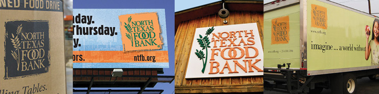
In 2015, NTFB senior leadership agreed that it was time to update their brand identity (shown below). While this twenty-year old identity had a strong brand presence within the community, it failed to reflect the sense of innovation behind NTFB’s new ten-year strategic vision and the non-profit’s goal to provide 92 million meals a year by 2025. The challenge: Create a more modern identity while maintaining some brand equity.
As NTFB’s agency of record, RSW’s first step was to audit the identity and its many applications to determine what was working and what was not. For example, it was clear that the orange color was a unique differentiator and created a powerful presence. However, the orange box was difficult to work with in many applications, and many felt its look was outdated.
The Solution
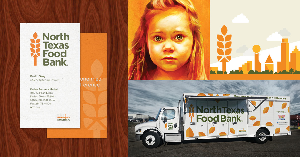
First, the new identity includes a signature look. In addition to a unique font design, an arrow is cleverly incorporated into the base of the wheat stalk symbol to represent ongoing improvement and growth, as well as the “north” in “North Texas Food Bank.”
By keeping the wheat stalk and the color scheme, the identity maintains some of the existing brand equity. It’s also easier to use. With the orange box shape removed, there are now two design options available: a vertical arrangement, or “staging,” and a horizontal one. The wheat stalk and the typography are also much easier to see at smaller sizes.
Finally, the identity strengthens NTFB’s national brand presence. The colors and the design create a stronger connection to the current identity for Feeding America, the network of 200 food banks
across the U.S.
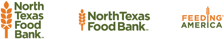
(Left to right) Vertical identity, horizontal identity, existing identity for Feeding America
Bringing the Brand to Life
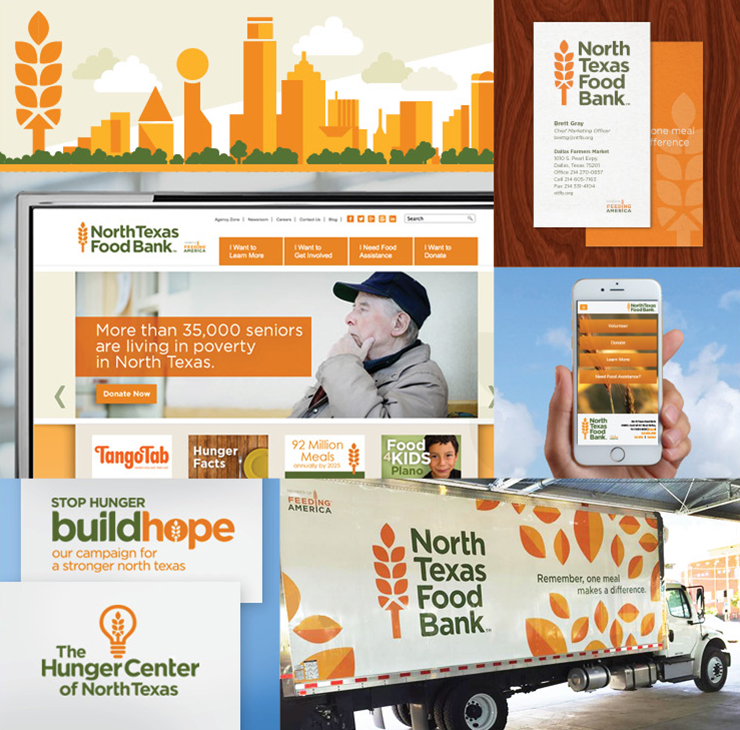
A brand style guide, easily accessible online, provides a roadmap for applying the new identity to communications. A simple, bold graphic style builds on the look of the new identity, and has been applied to donor and partner communications, truck graphics, website and mobile communications, and social media. Because orange has been associated with NTFB for some time, most of the new brand applications use it as a dominant color.
Unveiling the New Brand
This holiday season, NTFB’s new look is being introduced as part of their annual awareness and fundraising campaign. Based on donor research, the campaign follows the food bank’s previous strategy in that it shares stories of hunger from the community. The stories, however, are delivered in a new, more modern package. More impactful language, portraits of people in orange hues, and the new identity create a powerful message on billboards and other media.
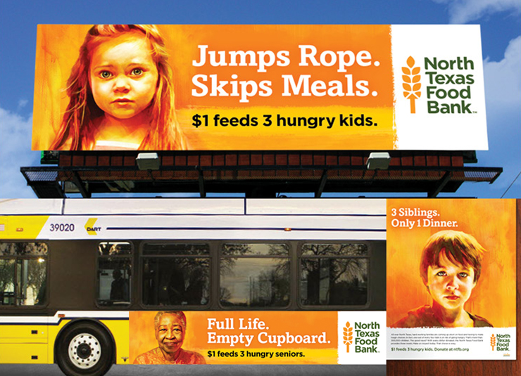
With almost 800,000 hungry people in North Texas, NTFB has to constantly think about what they are going to do tomorrow. Now, they have a brand that reflects their forward-thinking approach, and they hope it inspires more people to join their fight against hunger.


Leave A Comment